What is a purchase curve and why should you care?
This article will be more technical than usual as we’ll explore a unique way of examining sales data. We’ll learn from it and use this visualization to optimize our renewal business. 📊
1. The case of automatic renewal 🔄
For the purpose of data visualization, let’s imagine a subscription business with the following conditions:
We sell annual subscriptions. Subscriptions are renewed automatically. The renewal window is 2 weeks (see article on the renewal window) with a total of 3 payment attempts.
The first attempt has a success rate of 65%. The other 2 attempts will complete the missing 35% by 25% and 10% each.
First renewals occur on the 350th day of subscription (2 weeks before expiration). Subsequent attempts happen on the 357th and 365th days of subscription. No further attempts are made after expiration.
Plotting sales based on subscription days elapsed shows a curve with 3 peaks.
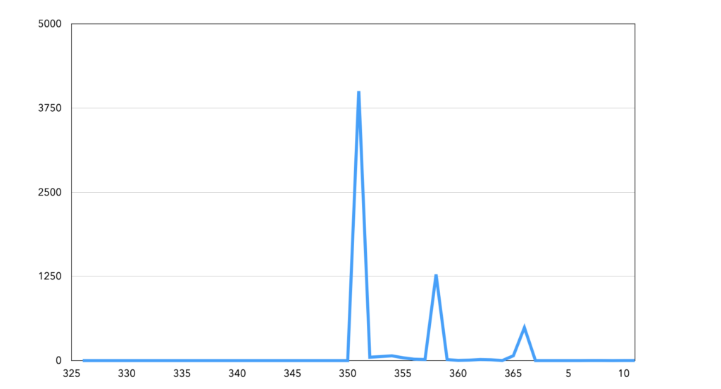
Table #1 : number of renewed subscriptions by number of susbcription elapsed
The cumulative sales give us the purchase curve 📊, showing 3 steps for the 3 payment attempts. We can see there are 3 steps matching the 3 payment attempts.
We can view this curve for different subscription groups: products, years, and acquisition sources. Variations in step size may indicate:
- As a potential problem in one of the billing attempts
- Or as an improvement in one of the previous attempts
- Or a difference in payment method “quality”
In addition, if the curve rises outside the billing attempt days, it means there’s a problem.
2. The case of manual renewal 🔄
Some merchants use a manual renewal procedure when customers cancel their subscription, or all billing attempts fail. Customers pay for renewal through a similar acquisition process, entering payment information again.
To foster the transaction, the merchant will use all the communication tools available (email, SMS, in-app notification, paper mail). Each reminder generates additional sales. Transactions spread out over time, forming an S-shaped curve.
Each message sent matches with a bunch of transactions, creating a series of peaks in the sales curve.
The purchase curve is more interesting in the case of manual renewal than in the case of automatic renewal. Indeed, it reveals more information about the customer’s behavior.
In the case of our example, the curve has several phases:
- between 335 and 360, the progression is linear: each message generates roughly the same number of transactions
- Between 360 and 365, the slope is steeper, sales accelerate, messages are much more effective
- After 365, there is a final burst but no “long tail” effect
Analyzing the purchase curve helps evaluate the renewal campaign’s relevance and adjust messages (add, delete, shift messages). We can also modify message content and observe its effect.
3. Going further 📱
The steps of the purchase curve show the spread of automatic and manual transactions in relation to the subscription expiration date. This information lets us adjust the forecast abased on event performance.
We can map all transactions – cross-sell, up-sell and renewal – on a purchase curve. This helps evaluating the ROI of each message sent to customers and maximize profitability while avoiding harassment.
Since communications concerning renewal are necessary for the execution of the service, they are considered service messages. They do not require the customer’s consent, provided that they do not contain a marketing message.
Please note that when the subscription is over, the subscriber becomes a prospect again. It’s no longer possible to send them service messages. It will be possible to send them communications only if they gave consent for marketing messages.
💡 Key Takeaways 💡
- The purchase curve is a visualization tool that allows you to match transactions and events: billing attempt or communication.
- Knowing your business purchase curve allows for better forecast.
- The purchase curve can be used as a tool to optimize and streamline your communication.

Why is my product mix different in Acquisition and Retention?

How to forecast the Upside accurately ?